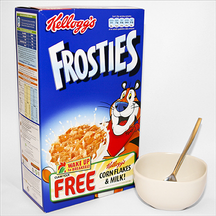
Great balance on this and very clear..even his name Tony is clear..
The newer version is not fitting very well on the box too much space above the bowl...its concentrating on getting the drawing right too much...the early version is more fun..appealing..more tiger and less human...it is a difficult to get the balance on a cartoon animal character...either its too one way or too or the other...the newer one is too human..the bowl being white is not very good it looks like a lot of milk..
I really hope the Jubilee boxes..I love Rice Krispies and Coco pops as well..will wake up Kelloggs and have a rethink on what they are doing with there characters at the moment..
I almost wish the old design would stay on the boxes...or a new artist is used who can learn from the old design..
I just love that monkey he has a great cheeky look...
The text on the boxes are so clear with black text on white..and red letters for Kelloggs..also its a good uniform for them all...
http://johnkstuff.blogspot.co.uk/2008/01/tony.html
Very inspired by John K and his design advice...very eye opening and have learnt loads from him so thanks John!


1 comment:
All that's missing now is the "BEST TO YOU" pledge!
Post a Comment